On a busman’s holiday, I had a chance to bicyle around Palm Beach and noticed that, not surprisingly, the one percent get some pretty nice urban design.
But what is surprising is that whether you’re in the one percent or the 99 percent, the bones are the same. Palm Beach’s Worth Avenue was created very much the way Federal Realty does a Bethesda Avenue or Foulger Pratt does an Ellsworth Avenue.
Worth Avenue, Bethesda Avenue, and Ellsworth Avenue are all parallel or perpendicular to the main traffic artery. You get onto Palm Beach island via Royal Palm Way, a spectacularly landscaped boulevard with green median and four travel lanes. But make no mistake, shopping and strolling are a few blocks to the south on the much more intimately scaled Worth Avenue. The same bones are in Bethesda and Silver Spring; the car traffic is out on Wisconsin and on Georgia.
And it points out a lost opportunity in Friendship Heights (which has the bones and the money). Friendship Boulevard and Jennifer Avenue run parallel to busy Wisconsin Avenue, but are lined with parking lots and loading docks instead of using them to create a retail enclave conducive to strolling and cafe lingering.
Furthermore, Worth Avenue’s little piazzas and mid-block connections seem to be the accreted decisions of varied builders over time.
It is, in fact, a real estate development created out of assembled properties, just the way our CBD zoning encourages assembly by offering optional method density increases for sites over 20,000 square feet.
It’s what you do with your superblock that makes the difference. Worth Avenue and much of Palm Beach’s (and South Florida’s) Spanish-Mediterranean architectural character was created by Addison Mizner. He didn’t go to architecture school, but did attend university in Salamanca, Spain and apprenticed with a Beaux Arts practice.
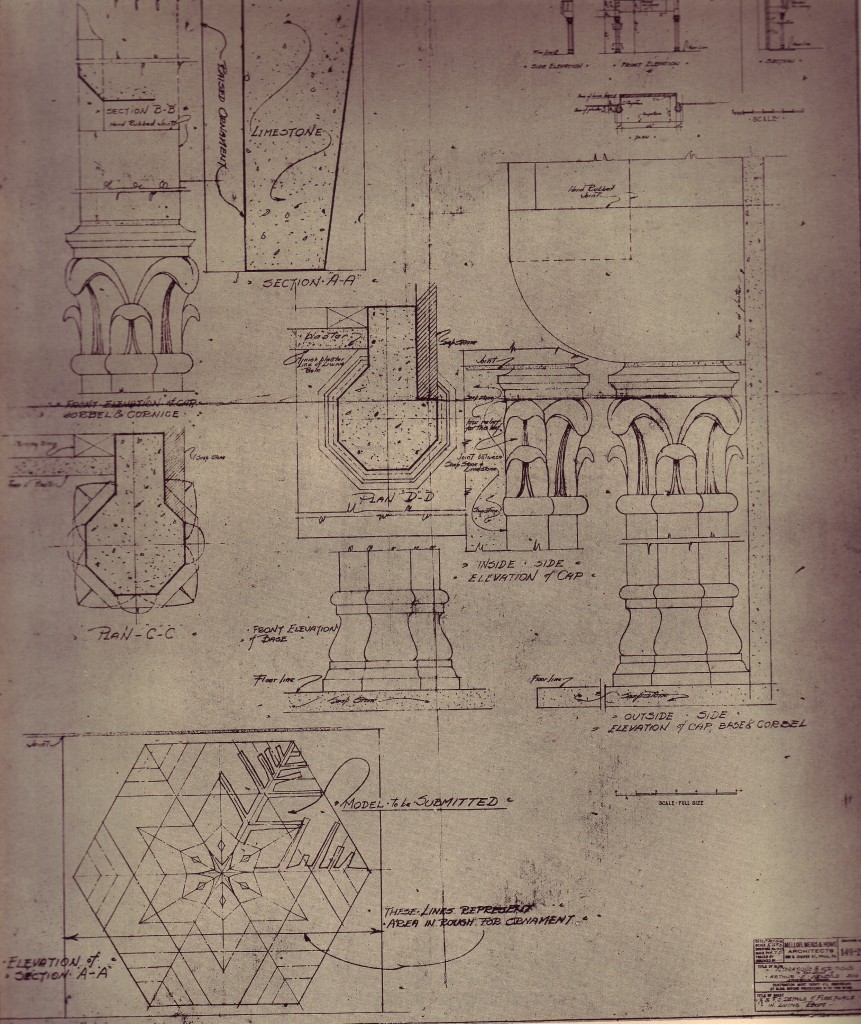
In the Beaux Arts, God truly is in the details. From “An American Country House,” a 1925 monograph on the work of Mellor, Meigs, and Howe, this column capital is carefully drawn, scaled, and constructed.
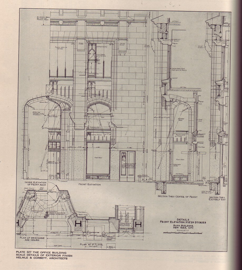
Sure it’s easy if you’re doing a luxurious country house, but these details come from the Bush Terminal Building on 42nd Street and Broadway in New York City as recorded in the 1925 “Architectural Construction, An Analysis of the Design and Construction of American Buildings.”
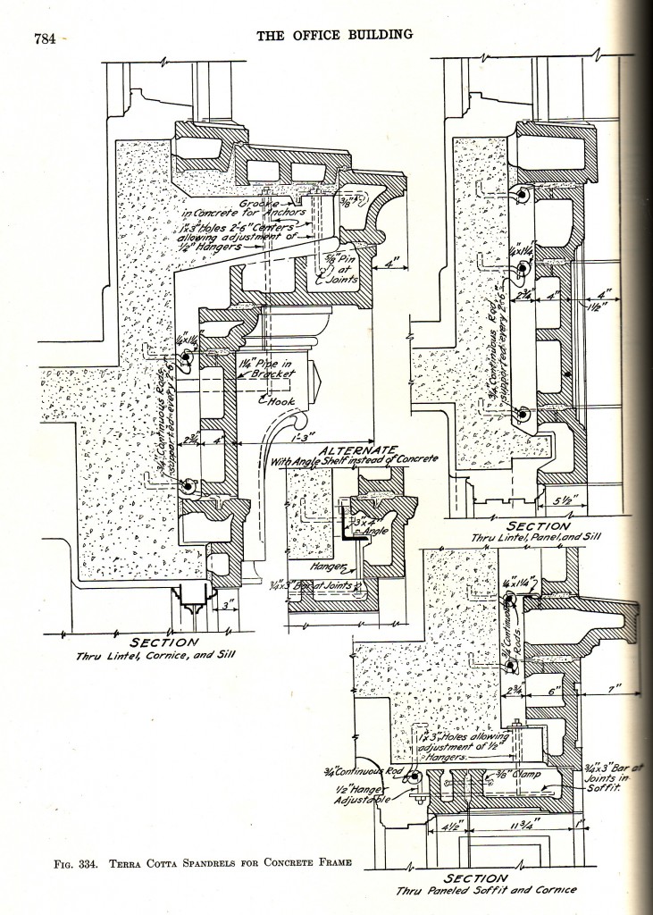
and it was not only decorating the building, but knowing how to put it together using the proper scale and materials. No dry-vit here
And one more thing. At the time, Palm Beachers used to clapboard cottages objected to Mizner’s “ugly, foreign-looking buildings.”
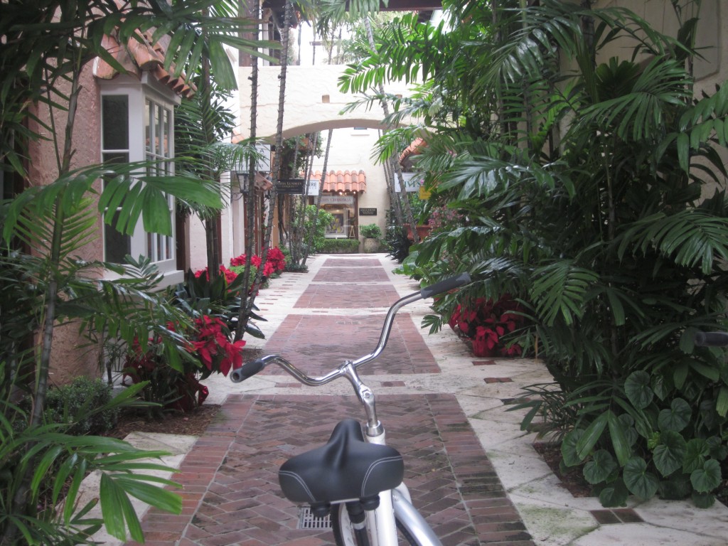
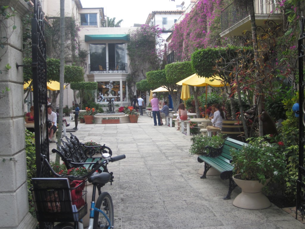
gk
Your post raises so many interesting points. Where to begin…
The Beaux Arts was a training method that was obsessive over the detail. Its practitioners could weave between gorgeous and grotesque with fractional changes in proportion, alignment, and shape. What feels so right about Mizner’s work in South Florida, or a beautiful home in Chevy Chase, versus contemporary attempt is scale and this attention to detail. An earlier post on Seaside reflected on how Duany, got the details right.
The hidden spaces of Worth Avenue are successful because they add another layer of charm and complexity to what is already a pretty amazing shopping street, and they do this by not eroding the street faces of Worth Avenue. Yet they are inviting and easy to find. In other words, on one level Worth Avenue feels like an intact street with continuous storefronts and arcades. It is not eroded by gimmicky recesses and pockets. If there is one thing that developers like Federal Realty have learned is that stores need to be on the sidewalk. On the other level a beautiful arched opening will lead you into another world, one that invites exploration.
Finally, the missed opportunity that is Friendship Heights. If there is one spot in the region (not just county) where demographics and walkability converge to provide a version of intimate upscale retailing, it is here. Rodeo Drive and Worth Avenue are notable for what they are not: even minor thoroughfares. They are side streets cutting across the grain of primary traffic flow. Friendship Heights as you have observed concentrates all of its stores on busy, unappealing Wisconsin Avenue. What make Friendship Heights so much worse is that 2 major projects were completed in the last half decade, at least a generation after urban planning mistakes have been made, lessons learned, mistakes remade, and lessons relearned. The two Friendship Heights projects would be notable if built in 1985, mediocre if built in 1995, and tragic having been build around 2005.
Thayer-D
This post goes straight to the heart of architecture’s main problem today. If God is in the (pedestrian scaled) details, then the pedestrian is the main benefactor. Unfortunatley, we are still working with architects who for the most part, have been trained under modernist orthodoxy, which ignores both historic styles and the pedestrian experience. These ideological blinders have the effect of removing a vast reservoir of architectural examples from the typical architects training, and thus denying many of todays architects the nimbleness and sophistication required to produce this level of detail in a rational and dare I say artistic way.
I think it should also be said that one of the Beaux Arts main legacies beyond stylistic agnosticism and attention to detail is the rationality of the overall plan, or schema. If you’re starting point is conceptual literature, sculptural abstraction, or parking requirements, the plan will never be as responsive to the site’s pedestrian potential as an unironic and rational analysis. Architectural periodicals from the transitional period of the 1930’s as the profession moved away from a (loosely termed) Beaux-Arts method to the anti-historical/car oriented Modernist method of training is quite informative. It’s also true that the move from pedestrian focused development to car oriented development during this period probably did as much as anything else to guarantee the demise of quality urban and architectural design.