Note: This archive page is no longer updated and may contain out-of-date information.
By Todd Fawley-King and Atul Sharma
Introduction
You’ve probably heard someone criticize a neighborhood or shopping area as “cookie cutter.” This description, often used to identify construction that has standardized or repetitive features, usually implies the buildings lack character and will diminish their surroundings. There is a lot to like about “cookie-cutter” construction; sameness can be enriching, and this type of design can help build great places quickly and affordably.
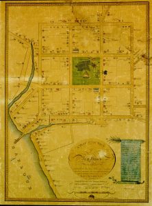
The plan of New Haven exemplifies the early New England township. Credit: James Wadsworth. A Plan of the Town of New Haven With All the Buildings in 1748. Lith. by C. Currier
Good cookie-cutter design is ingrained in the urban fabric of America, enabling the rapid settlement and expansion of the United States. In New England the repeated “cookie” is the 6-by-6 mile square township administered by a central village. These townships were organized around the quintessential church, meeting house, and commons. The Northwest Ordinance of 1787 took inspiration from those New England townships to spur settlement of the Midwest: Congress mandated surveying the new territory into 6-by-6 mile townships and dictated a formula for distributing the individual lots to settlers. Ultimately western cities of the plains came to be defined by their endless grid pattern, an efficient approach to quickly creating parcels for development.
Today we are experiencing a mass movement back to urban areas and to first-ring suburbs, and Montgomery County planners forecast a need to accommodate an additional 200,000 people over the next 30 years. This growth will be housed in our urban centers, along corridors, and through the retrofitting or repurposing of existing buildings. The same ethos of speed, efficiency, and quality control of cookie-cutter construction is needed, especially in light of the region’s affordability crisis.
The Criticism: Cookie-Cutter Design Is Boring
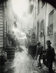
Jacob Riis iconic photograph, Bandit’s Roost, 59 ½ Mulberry Street, revealed the conditions of urban slums. Credit: Jacob Riis. Bandit’s Roost, 59½ Mulberry Street. 1888.
Condemnation of suburbia and, in particular, cookie-cutter architecture is not only about mass-building and repetitive façades, it is also a dig at neighborhood design and the perceived local lifestyle. This is fitting because the subject of the critique, the post-war suburban exodus, was itself a response to far more than architecture. Jacob Riis documented the overcrowded and unhygienic conditions in the cities at the end of the 19th century. Post-war, for-profit tract developments such as Levittown, N.Y., set aside the explicit utopian ideals, but heavily promoted the space and the leisurely lifestyle each family would enjoy.
Criticisms of cookie-cutter design didn’t exist until middle-class America moved to those tracts and became a suburban society: Malvina Reynold’s “Little Boxes” (a 1963 hit for Pete Seeger) exemplifies those earliest criticisms, coining the famous phrase about “ticky-tacky” houses that all look the same. The song, however, is much more about the homes’ occupants and their lifestyle than it is about the houses. Modern attacks on the suburbs frequently conflate and merge discontent with the indistinct and disorienting physical form (like Kunstler’s Geography of Nowhere, and Hayden’s A Field Guide to Sprawl) with the separate distaste for the suburban lifestyle itself (like Little Boxes or JD Salinger’s “The Catcher in the Rye”). The cookie-cutter cry conveys the sentiment that dull suburban architecture and the suburban lifestyle suppresses vibrancy and creativity. While defenders of the suburbs may agree the architecture isn’t daring, they reject charges that life there is uniformly “soul deadening, boring, and anonymous,” accurately observing that such critiques are born of urban elitism and snobbery.

“Ticky-tacky houses, all the same.” Credit: David Shankbonel, 2008.
The Response: Cookie-Cutter Construction Is Efficient, Effective, and Time-Tested
Understanding the benefit of good cookie-cutter design starts with addressing the valid criticism of the physical suburban form:
- Suburbs often have single-use zones, resulting in no amenities like restaurants or shops nearby, forcing people to drive to meet basic needs. More time driving equates to less time enjoying your neighborhood.
- With so much driving to be done, streets are primarily built for cars to be driven and parked, with little regard for comfort and safety for pedestrians or bikers.
- Large lots and excessive setbacks make homes feel isolated and sidewalks stay empty.
- With a lack of amenities nearby, houses tend to become “McMansions,” as the only attractive feature to sell is the house itself.
- Little mixing of housing types makes blocks look indistinguishable and homogenous.
In sharp contrast to the deficiencies in post-war suburban design, high-quality cookie cutter urbanism starts with an attractive kit of parts that gets used repeatedly. These parts are characterized by simple building types with slight variations in façades; connected networks of tight streets; intermixing of different types of housing; and businesses within walking distance. Sameness and repetition have a long history among the best examples of urbanism and architecture. What follows are a few examples:
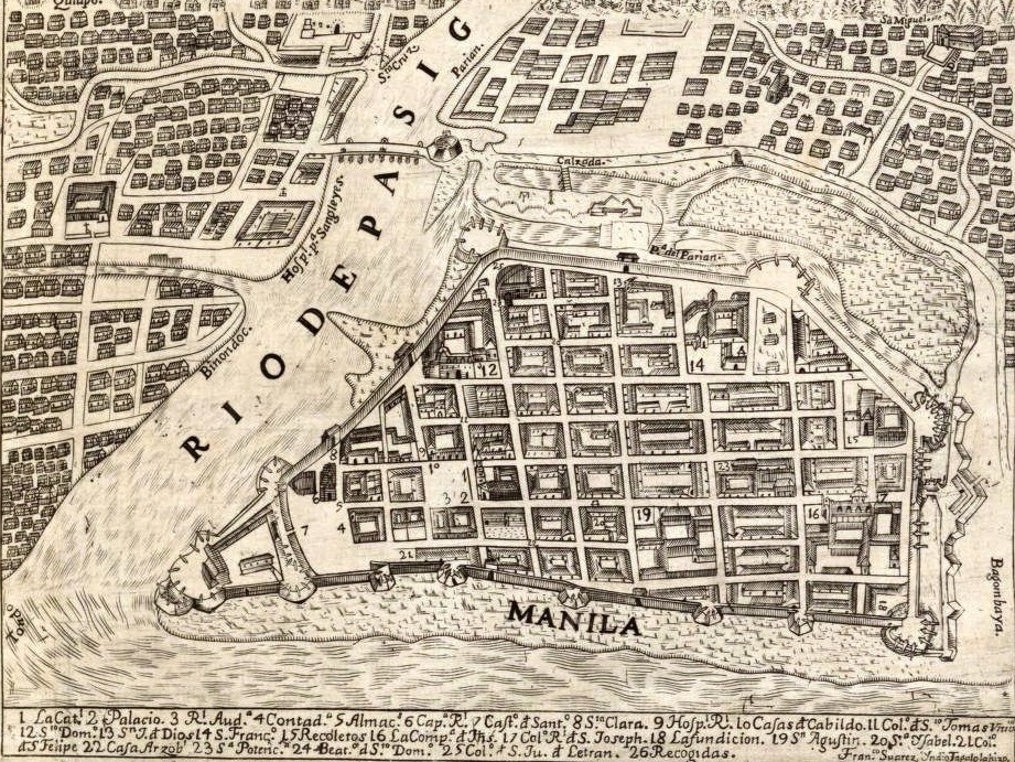
- Spanish colonial planning regulations culminated in the 1573 Law of the Indies, which specified within a narrow range the layout and defining elements of Spanish colonies, starting with the size and placement of the main plaza, the emanating street grid, and the orientation of churches. These cookie-cutter principles stamped thousands of iconic cities, from Santa Fe, NM; San Juan, Puerto Rico; Cartagena, Colombia; and Lima, Peru; to Manilla and Vigan in the Philippines.

The Spanish plan for Manila with its uniform blocks emanating from a central plaza and church. Credit: Pedro Murillo Velarde. Map of Intramuros. 1734
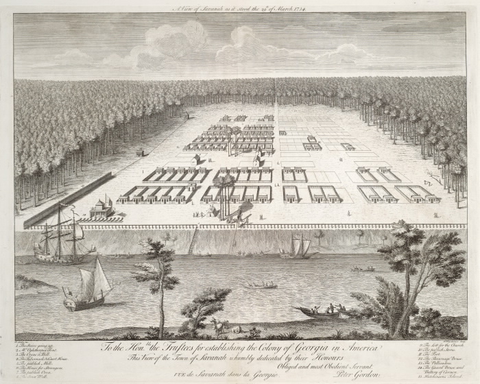
- The Oglethorpe Plan for Savannah in 1733 applied repetition of its grid and squares system and today 300 years later, Savannah retains its place as one of the United States’ most iconic cities.

Oglethorpe’s plan for Savannah. Credit: Peter Gordon. A View of Savannah as it Stood the 29th of March 1734
- Here in Montgomery County the early automobile suburbs of Silver Spring and Bethesda laid out in the 1920s are full of tight, walkable streets lined with highly-valued cookie cutter homes. A person with a perceptive eye strolling the neighborhoods of Westboro in Bethesda or Woodside in Silver Spring will begin to recognize that many of the homes descend from just a few original designs.
- The Royal Crescent’s 30 terrace homes built from 1767 to 1774 in Bath, England showcase to great effect the compatibility of sameness and high-quality design: the builder designed the uniform façade scheme behind which each owner then constructed to their own plans. Some 250 years later, the site remains one of the most iconic examples of pre-industrial revolution town planning/real estate development.

The Royal Crescent’s famous facade. Credit: Christophe Finot. 2006
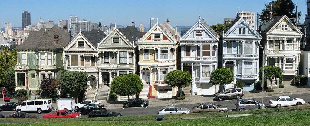
- San Francisco’s “Postcard Row” is defined by six exact-same, cookie-cutter Victorian homes from the 1890’s (enhanced by the downtown skyline backdrop). These homes are remarkably conventional examples of their style, looking much like the thousands of other Victorians through the city.

San Francisco’s Postcard Row. The builder of the six identical Victorians lived in the distinct green home on the left. Credit: Bernard Gagnon. 2008
- Between 1908 and 1940, Sears, Roebuck and Co. sold more than 70,000 affordable cookie cutter homes in 447 designs. These houses now form the basis for numerous historic districts nationwide, protected for their architectural and urban value.
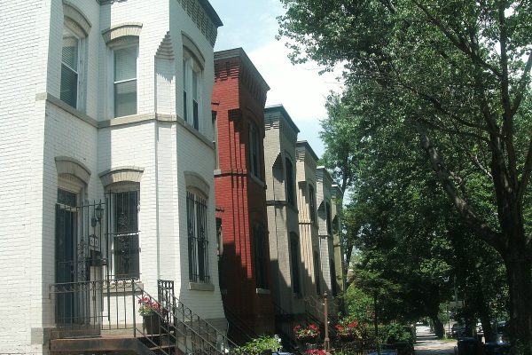
- In Washington, D.C., a walk across the Capitol Hill Historic District to Hill East charts a path starting through blocks of square-bayed Victorian row homes with few unique marks, and ending among copies of a house so common locally some refer to it as the “Washington Row Home.” It is actually a “Wardman,” named after the developer who between 1900 and 1930 built an estimated 2,000 of them at prices affordable for working professionals in what was then a suburb.
These few examples, taken from among countless options, shows that criticism of standardized design is unwarranted: instead, it is the recipe that makes the difference between dullness and delight.
Why Does Cookie-Cutter Development Matter for Montgomery County?
We can accommodate the growth of our county while simultaneously making it more walkable and amenity-rich consistent with the goals of Thrive Montgomery 2050, by using high-quality, cost-efficient cookie-cutter urbanism to replace obsolete shopping centers, office parks and garden apartments of the post-war suburbs. In existing residential zones, innovative approaches to reduce complexity and costs without sacrificing design standards will be essential to making the development of small, multi-unit properties known as missing middle housing part of our solution to high housing costs.
Streamlining design and limiting options reduces cost. We need to make high-quality, walkable, urban design “plug and play’” so it becomes the cheapest, easiest, and most ubiquitous development type. One key approach is making the regulatory process faster and smoother with fewer discretionary permits, as was recently done with Portland’s zoning reform for small-scale, multifamily buildings. Another potential approach is pattern zoning in which certain designs are pre-approved in the zoning code for specific parcels and are by-right, requiring only a building permit and no further planning department approvals.
As the construction industry incorporates greater levels of prefabrication, modular offsite fabrication, and robotics-assisted construction, technologies and processes that benefit from repetitive designs, it is more important than ever to ensure the cookie-cutter construction of the future incorporates strong fundamentals of architecture and urbanism.
Montgomery County’s “Box of Cookies”
As we accommodate growth over the next 30 years in “Complete Communities” as envisioned in Thrive Montgomery 2050, good cookie-cutter design is a powerful tool that can be used to create beloved neighborhoods that stand the test of time. Our progressive planning policies have already paved the way for buildings and public spaces that could be replicated in numerous parts of the county, without looking dull or out of place. Our Complete Streets Guidelines provide a limited menu of design for streets that cater to all users in different urban, suburban, and rural environments.
Our Commercial Residential Zoning and Parking Standards have led to the creation of mixed-use apartment buildings atop retail with screened garages that create walkable, vibrant streets. These buildings can be skinned in a variety of styles and adjusted to meet site conditions while utilizing affordable construction techniques. In our mid- and up-county areas, developments such as Kentlands and King Farm exemplify large, attractive neighborhoods built using a limited kit of high-quality parts. As we seek to retrofit buildings that are becoming obsolete due to changes in how we work, live, and shop, additional cookie-cutter typologies could be created that expedite development without sacrificing character.
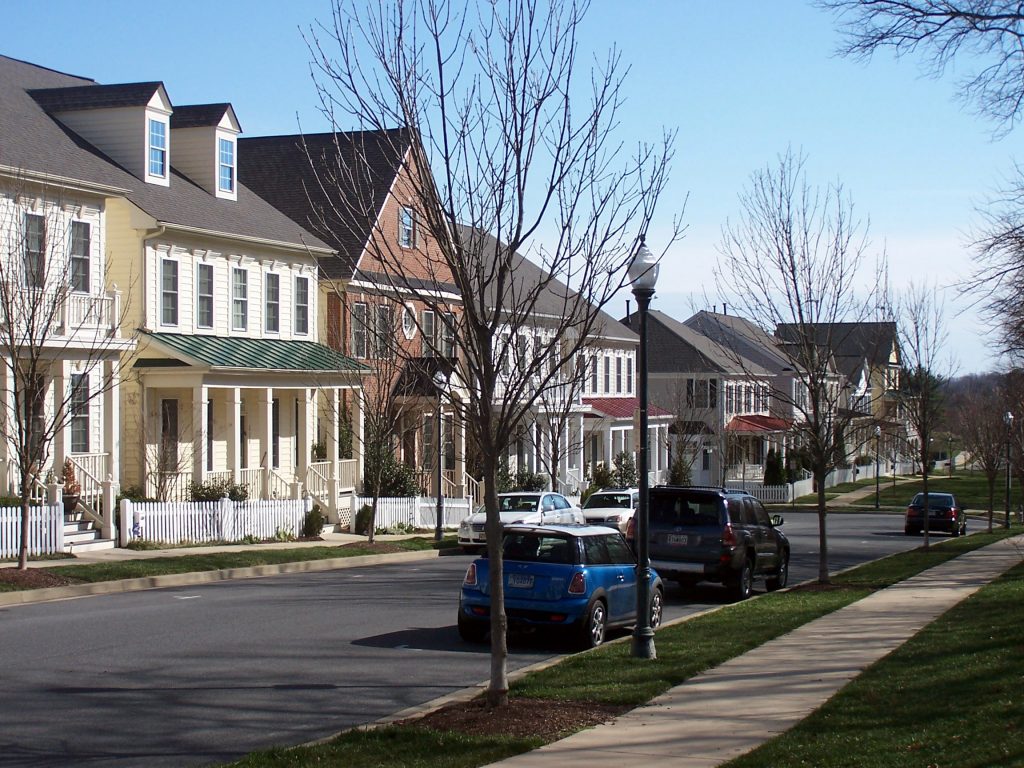
An attractive street in the Kentlands. Credit: Beyond DC Blog. 2011.
Criticism and debate are healthy elements of improvement. But effective arguments require a recognition of nuance and an evaluation of pros and cons. When we object to a proposed building or development in Montgomery County, let’s discuss why we find it ugly, boring, too large or too small, tasteless, or otherwise. But let’s not dismiss something simply because it is cookie cutter. It’s time to recognize that there’s plenty of sweetness to this type of development.
