Note: This archive page is no longer updated and may contain out-of-date information.
On the rare occasions that the words “architectural character” and “Fenton Village” are used in the same sentence, they are usually also joined by the words “lack”, “dearth”, and “paucity” (ADMIT IT!). (For the uninitiated, the Fenton Village is centered one block east of Georgia Avenue in Silver Spring, north of the train tracks.) These exclamations are not without foundation: Silver Spring Towers, Safeway, and 8120 Fenton Street are not doing the street any favors. Nor do the converted and expiring bungalows and four-squares suggest a Village with a unique character (cf. Forest Hills Gardens, et. al).
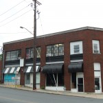
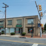
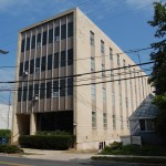
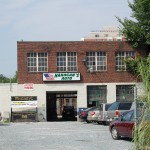
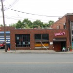
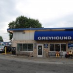
But the dedicated observer (thank you!) will notice that, scattered about its ten or twelve blocks, Fenton Village has many buildings that share an engaging architectural language that includes a mix of modernist, deco, and simple classical elements (I will let the Silver Spring Historical Society provide the nomenclature). These buildings are most typically one and two stories (mostly retail, restaurant, and service), but there are a few more-vertical examples (pretty much office buildings).
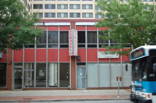
These buildings are scaled to engage and define the street and provide an urban village (add your own quotes as necessary) feel characteristic of the models to which Fenton Village seems to aspire: Mount Pleasant Street and Columbia Road in the District. As more development proposals come in for Fenton Village (six and counting!), the design teams should build upon these precedents (not literally!). So, the next time you head over to Fenton Village to get your fix of good coffee, comic books, golden oldie 45s, used books, Ethiopian food, or spicy beef patty, hold your head up high (literally!) and check out the cool wallpaper.
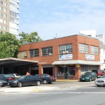
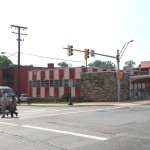
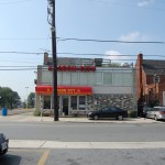
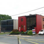
Rob in Silver Spring
All very true. The writing style of this post, however, would be (greatly) improved if there were far fewer (count ’em!) phrases put into parentheses (just sayin’). I’m dead serious…readability is 90% of the enjoyment factor in a blog post. Make it easy on us ADD afflicted readers because if we have to think too much, we’ll just click off to the next (shiny) web site that draws our attention.
wombat
Hey, there’s at least one fan of the converted bungalows out here.
(Also, ditto Rob’s comment. Maybe you are working too hard to sound informal and bloggy?)
elza hisel-mccoy
(too-shay: internal dialog patterns).
@wombat: the little gingerbread houses on Silver Spring Avenue just west of Fenton are dynamite. I only wish that, since they are the last, we could flip one to get the symmetry.
Kathy J, Washington Gardener Mag
I agree with much of this post and your choices on Fenton – but the Greyhound station, really? I can’t think of an uglier buildin on that strip.
Brains from my father
Fenton Village is a great place if you want to park your car, repair your car, or fill up your car with gas. Throw in the amount of space that is currently vacant and you get an astounding amount of underused land in an area so close to public transit, high density development, and interesting destinations. Hopefully some of the development that is now in the pipeline will come to fruition and change the status quo.
But I agree that there are some architectural gems in Fenton Village. Some buildings not included in the above photos include Wellers Dry Cleaners, the Thai Market, and Kefa Cafe. We should work to preserve these and other interesting small-scale retail while developing the vacant land.
But the building that I find offers the greatest architectural pox on Fenton Village (greater even than the Silver Spring towers)is the Bank of America building with the surface lot and drive-through ATM–as if we live in Southern California.
Brains from my father
My previous post refers to the Bank of America building with the drive-through ATM. I meant to write Chevy Chase Bank
Jerry A. McCoy
For more information on 910 and 912 Silver Spring Avenue (the “little gingerbread houses”), go to takoma.com/ssthenagain/2009/12/shadows-of-the-past-remain.html
Thayer-D
Lest we forget the buildings on Georgia avenue that have a late victorian flavor such as the Bank building at Bonifant and Georgia, or across the street, the Masonic temple. This was the main street of Fenton village and shouldn’t be studiously excluded. As for your comment…
“As more development proposals come in for Fenton Village (six and counting!), the design teams should build upon these precedents (not literally!).”
That is exactly what they did in the Cissel-Lee building you champion in your first blog. They destroyed that building taking away it’s beautiful three over one windows on the street and replaced it with a black wall of oh-so fashionable wood decking. As for the architectural school obsession with origionality and not “literally” copying previous styles, I think we’d be better served by focusing on how a building works than the provenance of it’s style. The little international style buildings you portray are “literal” copies of Mieas and every other curtain wall of the 1960’s, but who cares! Does it engage the street properly, is the scale appropriate, does it enliven or deaden the street; those are the attributes that will make the redevelopment of Silver Spring a success or failure.
All criticism aside, I do commend you all for this forum, I think it will be invaluble.
elza hisel-mccoy
For many years, I harbored a secret desire to convert the Cissel-Lee building into a nightclub, leaving the ground-floor picture window in place. That was one of my favorite buildings on Georgia Avenue, and remains so in its new incarnation. I love stumbling upon the Frank Furness-designed rail station in Chestnut Hill (Philadelphia) as much as the next person excited about stumbling upon a Frank Furness train station, but I’m not averse to a new take — if it’s good.
I agree that how buildings define public space — be it street or plaza or garden — and activate the street is the first priority, with good design (whatever style) a close second.
I would disagree that Fenton Village is littered with high-minded reproductions of Miesian boxes. The utilitarian masonry and predominance of vertical elements provide pedestrian-scaled versions the streamlined art deco and moderne styles that are very affecting and should not be dismissed.
Thayer-D
“I would disagree that Fenton Village is littered with high-minded reproductions of Miesian boxes”
Not sure I said that, but either way, we’ll have to agree to disagree on the Cissel-Lee building. While I admire your interest in design, your original post where you laud certain architects “that are working to upgrade Silver Spring’s architectural character” I think, speaks for itself. There are so many vacant lot’s to do what you say, but that building was one of the stronger contributing buildings in terms of this Fenton Village identity you proport to be interested in promoting. I look to your office to be one of the advocates for what could be, but not at the expense of what we have left.
As for the Meisian knock-offs, my only point was that modernists love to decry the mimicry of revival styles only to ignore the revivalist nature of the current mid-century modernist fashion. It’s hypocritical. The “new” Cissel-Lee building could be in Miami or Rotterdam, but the form is straight out of 1930’s European precidents. I’m not saying that it dosen’t belong here, but when you replace one of the few buildings of character with a blank wall, you deaden the street, whatever style you personally advocate. Even the Meisian boxes do better than that.
claudia kousoulas
Elza, I’m so glad you wrote on this. I’ve always thought that Fenton’s modest curtain walls had real style. Certainly better than the dry-vit tilt up that passes for architecture at this scale today.
I don’t know if it quite qualifies as mid-century modern, but it’s close!
payday loans
I want to thank the blogger very much not only for this post but also for his all previous efforts. I found montgomeryplanning.org to be greatly interesting. I will be coming back to montgomeryplanning.org for more information.
physical therapist
Pretty nice post. I just stumbled upon your blog and wanted to say that I have really enjoyed browsing your blog posts. In any case I’ll be subscribing to your feed and I hope you write again soon!