The second half of the High Line opened this summer and even though it’s a one-off, not likely to be funded in these straightened budget times or replicated in less dense environments, it’s still intersting to think about making parks out of places that are not traditionally green.
Enjoy the pictures.
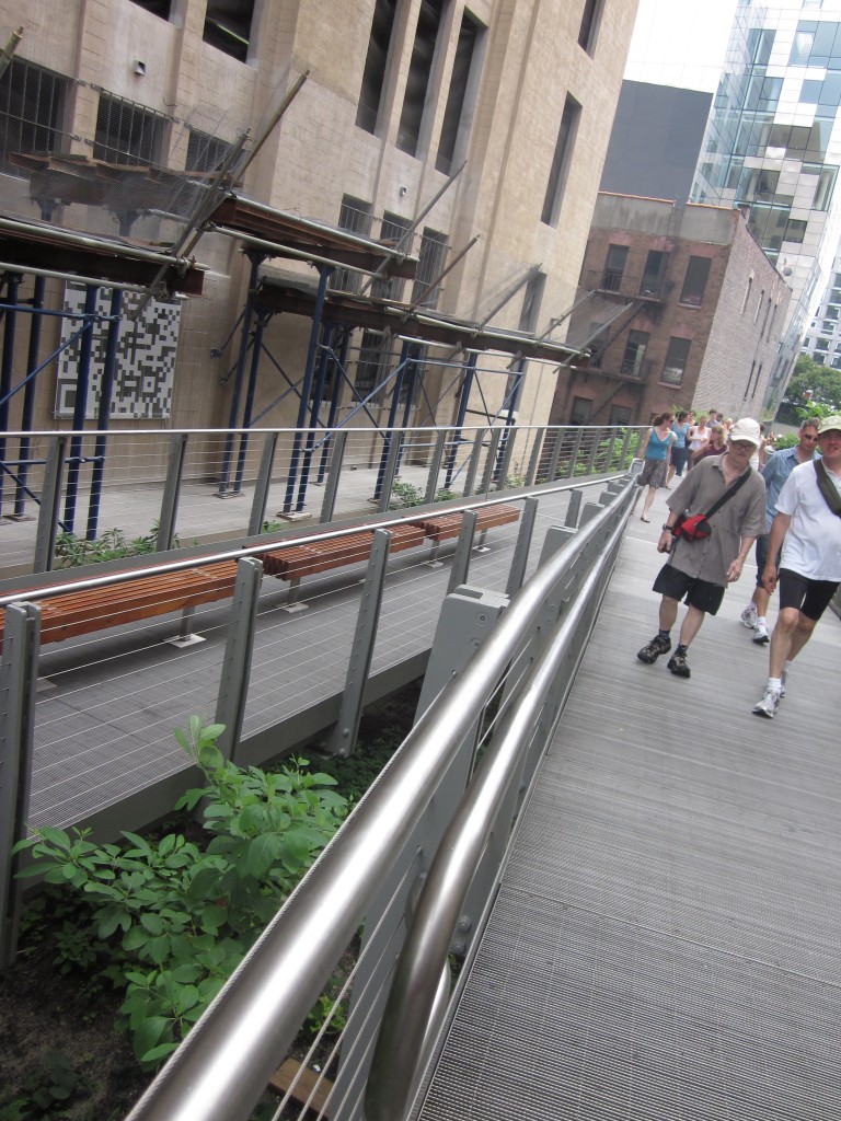
one of the repeated design features on this leg are seating spurs that reference the park's past as a rail line and allows the user to step out of the traffic flow. Another feature is raising the metal grid path above the original surface, saving a bit on landscape materials and maintenance
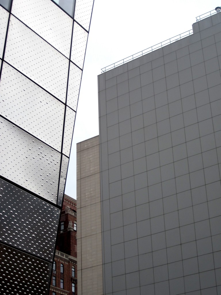
unlike the first leg, property owners now know the High Line's value added and developed accordingly, even before the park was finished
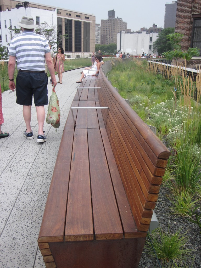
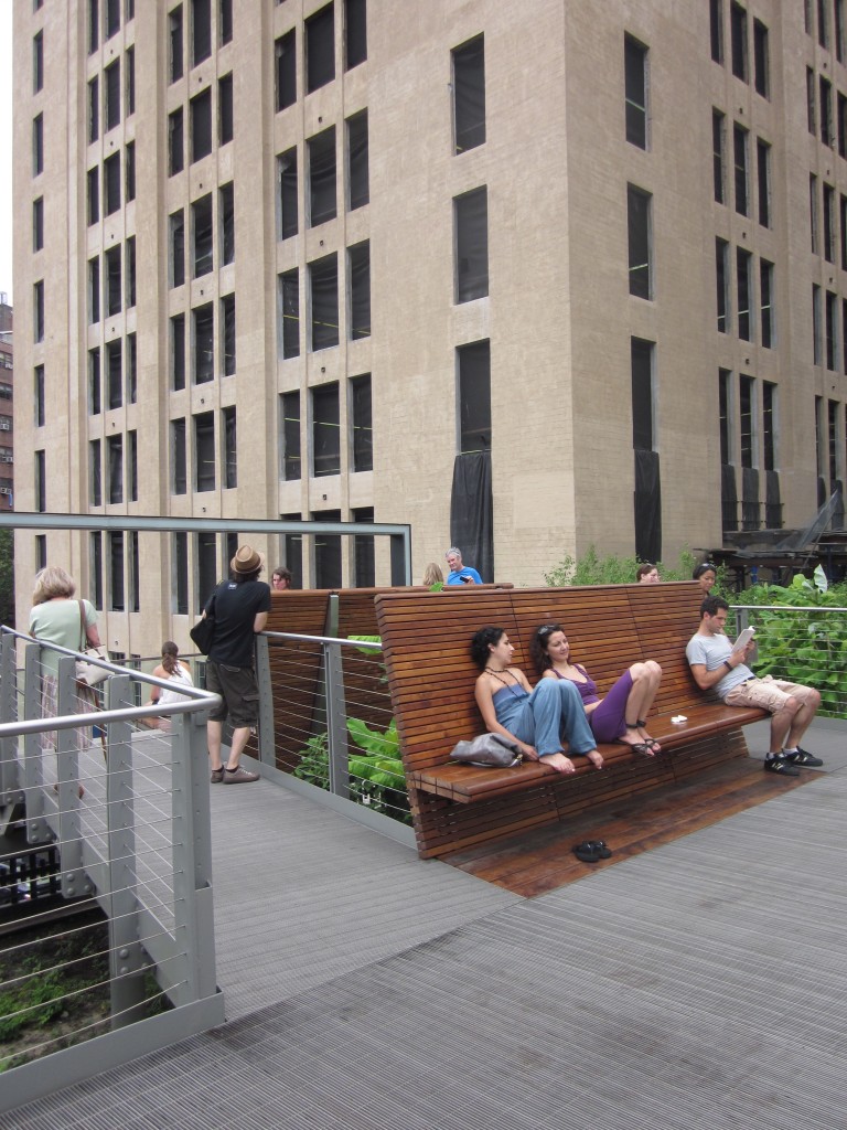
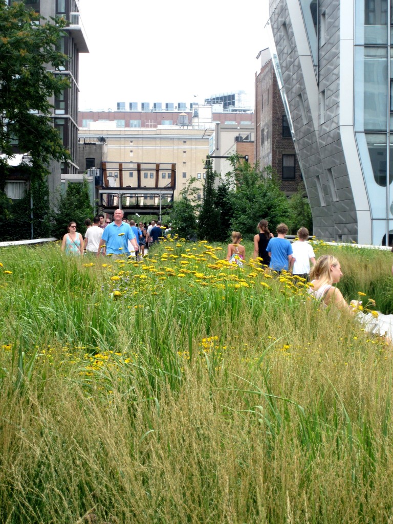
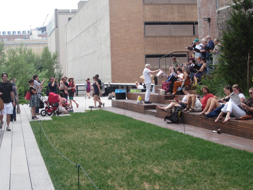
Bob
Gee, I thought having pedestrians up above the street level was anti-urban. At least that’s what we heard in all the arguments against connecting the new Silver Spring library to the parking garage.
claudia kousoulas
You’re right, but this is a park, intended to be a retreat from urban. Though the High Line is linear and you could use it to get from one part of town to another, it’s also far on the far west side (which makes for nice river views) and out of the main routes travelled by pedestrians. We had to walk past the Morgan Post Office loading dock to get to the 30th street entrance, not exactly a ped-heavy route.
Our CBD streets are hardly heavily travelled enough to warrant an above street level park. After all, this rail line was originally built spearate industrial traffic from city streets.
What I take from it is creating a space where there was none.