Note: This archive page is no longer updated and may contain out-of-date information.
Seattle’s Downtown Transit Tunnel was designed as a collaborative project between the project consultant (Parson Brinckerhoff Quade and Douglas Inc.), the architecture subconsultant (TRA), and 25 artists. The team created what they have termed a distinct “art-itecture” for each station representative of the neighborhood it serves.
 The result is a fantastic model for the stations along the proposed Purple Line and the Corridor Cities Transitway.
 Even after just a couple days riding the light-rail or buses through Seattle’s stations, a quick glance out the window provides a distinct impression that tells, or shows, where you are. The collaboration is obvious in the integration of artistic details and the creation of a place. You feel that the design process was a conversation – between the place informing the design of the art and the art and architecture reinforcing the sense of place.
 Signage and practical information is kept consistent; station logos are modified, but from the same graphic language; and safety is served through varied applications (such as paving, bollards, etc) of similar techniques.
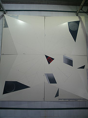
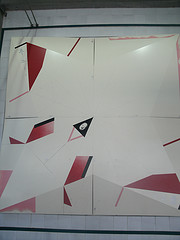
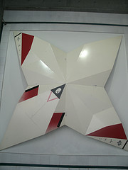
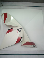
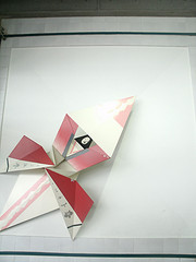 One of my favorite artworks is in the International District Tunnel Station by Sonya Ishii — a grand gesture spanning almost 150 feet along the eastern wall.
This work is a set of nine, 14-foot by 14-foot aluminum panels at various folded stages in the creation of two origami figures. The panels begin virtually flat and end up 2 feet deep to accommodate the folds. One reads from left to center, the other from right to center (as pictured, the top photo is the left).
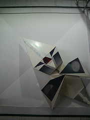 The heaviness and size of the steel is appropriate for the size of the station and, in this context, actually feels as light as traditional washi origami paper. The colors are simple and bold (not unlike the totem figures of the northwest Native American works that dominate the Seattle art scene).
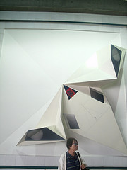 In all, the work is derived from the place – an international art form in the international district, while helping create a sense of place – “get off the bus at the station with the huge origami figures” (and I bet a first time visitor could pick the station from a random list of all the stations…). This place-making art draws from the uniqueness of the place. It wouldn’t be a stretch to call this an aesthetic example of the dialectic synthesis, as the philosopher would call it, and a model for civic art.
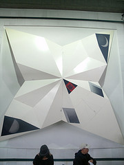 Communities invest in places that reflect and reinforce their sense of self; the artist and design team can bring new perspective and form to that sense. We would be wise to learn from examples such as this before our plans for the Purple Line and the CCT get too far down the, ahem, line.