Funny thing, the number of project plan applications in Silver Spring peaked right before the requirement for workforce housing became effective. The now voluntary program would have required affordable housing for any projects over a certain residential density threshold. The fact that we had a rush of applications to beat that deadline was bad news for those of us in the “workforce” that need affordable housing, but it turned out to be good news for those of us who love art in public places.
Three examples, originally approved in 2005, have recently been installed around the Silver Spring area. Each uses various metals in significantly different ways and achieves distinct effects. Generally, they add a touch of contemporary style to otherwise traditional buildings and public spaces. Likewise, they are each engaging and visually interactive in their own right. But I’ll let the photos speak for the artworks and only add a couple personal notes regarding each one.
Wendy M. Ross, Sisyphus
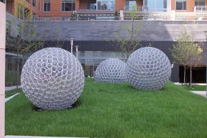
Three metal spheres set on a raised and mounded lawn; built of conical elements that point towards the hollow center. Originally conceived as three spheres with distinct patterns – short, straight metal elements, curved lines in a lattice, and conical elements – the artist revised the concept and built them all from the conical elements. Personally, I think this unifies them and creates more of a sense of gravity between the pieces; whereas the different patterns could have made them seem more autonomous and the overall work less cohesive. And, to be very theoretical, the repetition of forms is more analogous to the theme of repetition in the myth of Sisyphus.
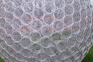
Unlike Camus’ take on that myth, however, there is nothing absurd about our relation to these works; they are clear and structured. The simplicity of the pattern, the contrasting softness of the grass, the variation in color and movement seen through the cones makes this a distinct and welcome addition to our streetscape. Located on Cameron Street near the intersection of Cameron and Spring Street.
Ray King, Beacon
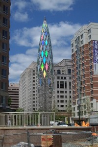
Reflection and refraction are key to catching the eye and differentiating King’s sculpture from the grays of the background. Using glass facets laminated with silver holographic film and a web-like tensile structure the overall form is similar to those used by early futurists, but the technique and application of new materials create a distinct and contemporary landmark.
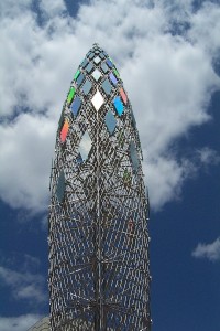
Like Ross’s piece, the open framework allows color and light to be seen through the piece, so the interstitial spaces constantly reframe the background. But in this work, the dynamism of the ever-changing refractive facets creates a more immediate sense of color and interaction. Located at the intersection of Blair Mill Road And East West Highway.
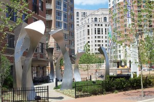
Mary Ann Mears, Lotus
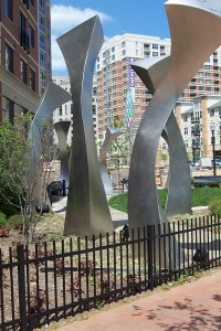
The name is a guess – as it wasn’t titled in the application documents – but references the Egyptian lotus columns that inspired the artist’s work. The intent with these pieces was to bring a sense of scale and to frame movement through the open space.
Unlike the previous two works, these pieces are distinctly solid and much less rigidly geometric. In fact, there is nothing rigid about them. Like something from a surrealist’s melting canvas made 3-dimensional, the sense of movement in this work is more subtle and organic. Seaweed in an undercurrent, hot and lazy dancers, swaying trees…. Each three-sided piece is done in a brushed finish that only slightly reflects the colors of the landscape, similar to a hue seen through a fog. They are large, but intimate and beautifully frame entrances in space as well as the building, and – quite happily – artworks on other sites. Located at the point where Newell Street and Blair Mill Road hit East West Highway.
(Looks like her website is still a work in progress; if anyone has a good link to her stuff, rather than piece-by-piece, please post.)
