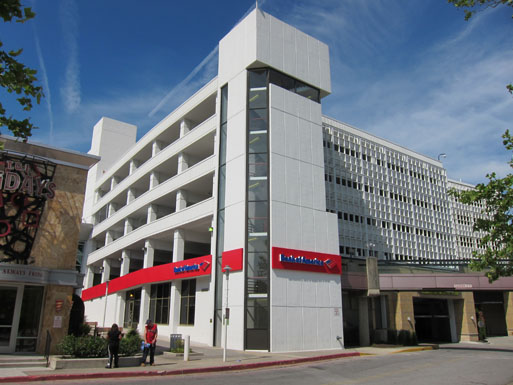
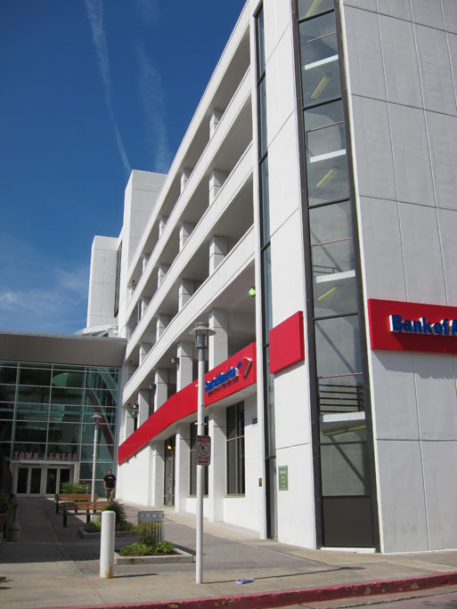
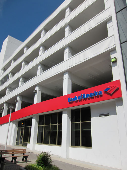
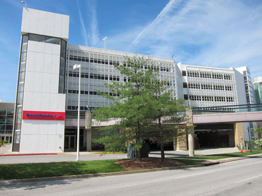
Right around the corner from the parking garage I showed yesterday is a very nice integration of retail into a parking garage. It is difficult to say if the result was intentional or serendipitous and I think the success relies in part on the proximity of the surrounding buildings. But I appreciate what looks like design intent made manifest.


The sharp contrast between the stark bright(ish) white and the shock of red establishes a nice hierarchy and rhythm for that side facade, while the tower anchors the corner and announces there is something there.
What you wouldn’t know from the pictures, however, is that the door on the longer facade is somewhat of a side door, entering into a vestibule with steps down to the bank floor. The “front” entrance faces the street, as opposed to an interior courtyard, but is overshadowed (literally) by what appears to be a pre-existing and inadvisable pedestrian bridge. (The entrance is in the corner behind the lamp post.)

Kevin Jean-Gilles
Excellent post!
Just wanted to let you know that “we” (the public) really do read this stuff and appreciate your keen observations and insights.
Keep up the good work!
elza hisel-mccoy
Thanks! I will try to keep it interesting.