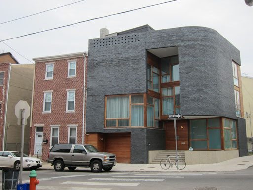
Fitting “contemporary” design into existing neighborhoods and development can be a tricky business, especially where the existing character is strongly defined and fairly uniform. As new projects fill in holes in our more-developed areas of Montgomery County, designers will mount these challenges with greater and lesser success.
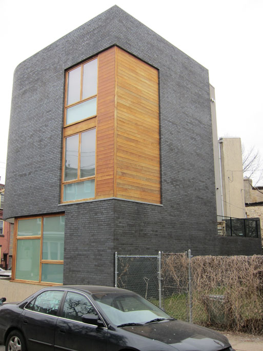
A good case study is the Split-Level House in Philadelphia. Designed by local architect Qb, it has been featured in several design magazines and websites (including the fantastic archidose.org). But seeing the buildings close-up and in context (which is often conspicuously absent in much architecture coverage) is the real test for how the design works.
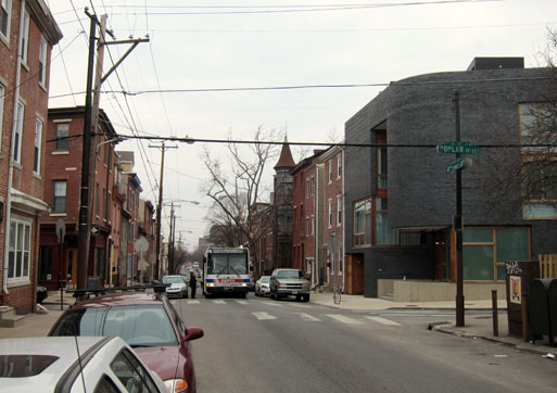
So here’s the shot down 4th Street. The height is in the right place, but I think the excavated corner and the material change at the garage is visually disruptive. Perhaps if that area at the entry could be used as a patio it might connect better to the street, but I seem to remember it being a (vacant) planting bed. (More on the cupola down the street in a moment.)
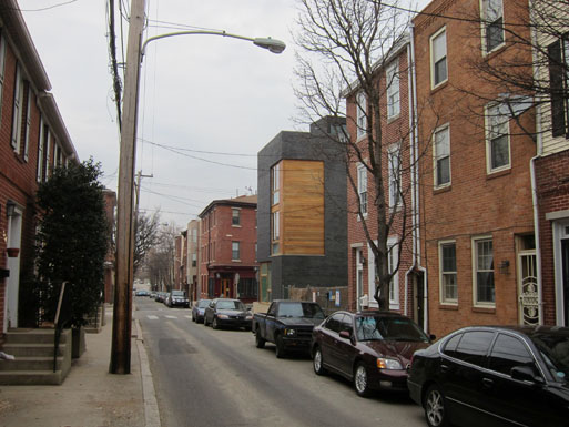
Looking down Poplar, however, I think the house is more successful. The height is good, the change in materials recalls the base-middle-top of the rowhouses, and the windows continue the established rhythm. Much better.
You also don’t often get to see the back of the buildings very often either. The patio will probably be a little enclosed, assuming a party wall neighbor, but for now it is quite airy. Maybe when the neighbors put something up they will move the tables out front!
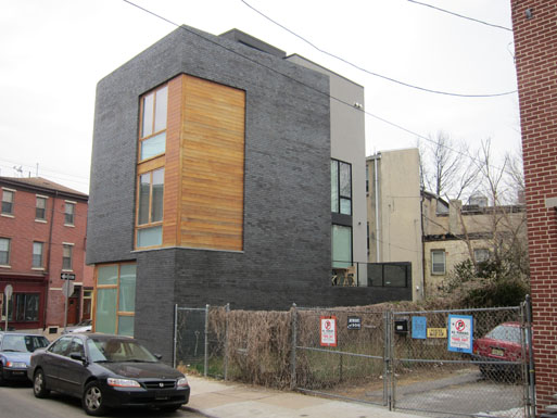
Also a bit of a detail of the corner, for your delectation.
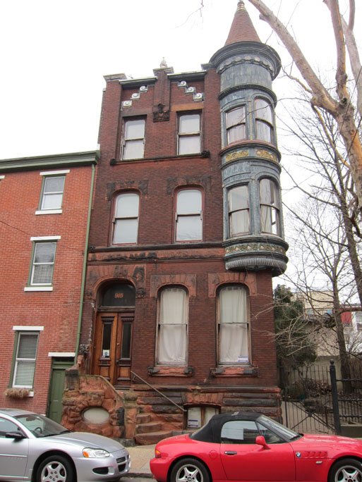
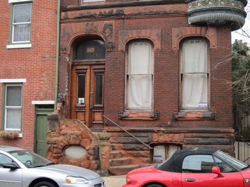
And finally, for contrast, a bit more of the neighborhood: most positively 4th Street. Awesome. Enjoy.
Thayer-D
Although it wouldn’t make my short list for favorite buildings, it looks quite striking. Here, I think context is key, in that it sets the building off. A street full of these abstract buildings might feel a bit alienating, but as a unique corner building, not bad.