Facade-ism. Facade-omy. Building facades are harder to design than they look. Especially with bigger buildings. Look around you.
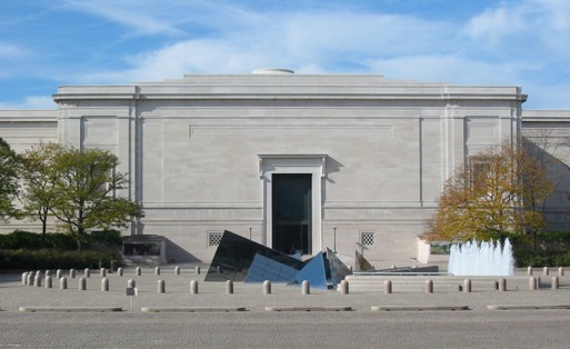
There are always of course excellent examples. The National Gallery of Art, West Wing, designed by the fabulous John Russel Pope, is a beautiful building.

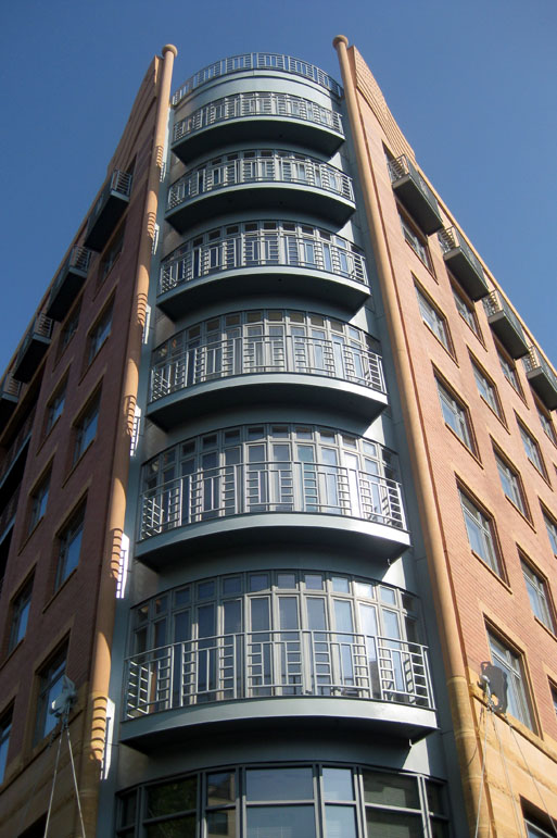
DC architect Phil Esocoff also does a nice job with attractive facade design.

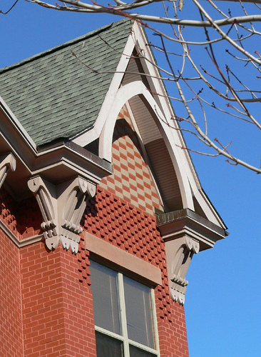
There are far more stinkers, however. For design, I prefer smaller buildings. Like small gardens or landscapes, there is usually room for only one organizing principle and its elegant elaboration. The rowhouse is a good urban example of this and the DC area has a wealth of fetching specimens in Alexandria, Georgetown, Dupont Circle, and of course Capitol Hill. Another local architect, Amy Weinstein, has done beautiful work in southeast DC on the Ellen Wilson Homes (and on a HOPE VI affordable housing budget!).

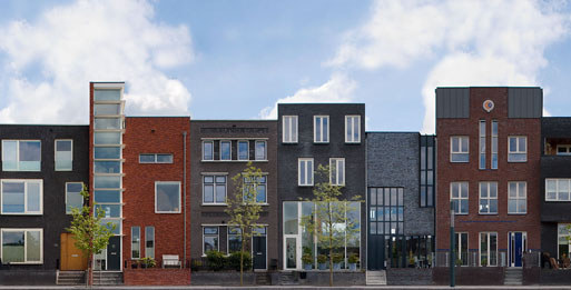
This is all to deliver to you a link I received this morning for a street of contemporary rowhouse facade design on Lonnekerspoorlaan in Roombeek, Enschede, in the Netherlands. The detail below is from a larger streetscape. This looks a bit like a facade project we did one semester in school, where we each made cereal-box scale models and placed then next to each other. Lots of ideas here. Dig away.

schmod
The Ellen Wilson development is one of my favorite new developments in DC, let alone an *affordable* one. Most of the buildings are gorgeous, and have the rare trait of being contemporary while also fitting into the DC’s architectural vernacular.
I must have driven past it a hundred times before learning that the entire block was relatively new, and also a housing project. Obviously, DC should be looking to replicate this success on other undeveloped plots!
(Coincidentally, I’m not a huge fan of any of Weinstein’s other buildings)
elza hisel-mccoy
I’ts amazing what she did with stick building and four inches of brick. I also like the deco collage effect at 660 Pennsylvania Avenue.