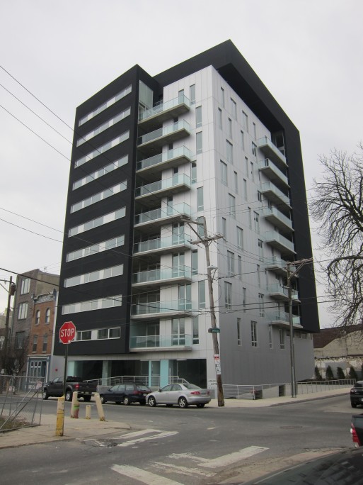
From some angles, the American Loft building at Brown and American Streets in Philly’s Northern Liberties looks more like a competition entry than an actual building.
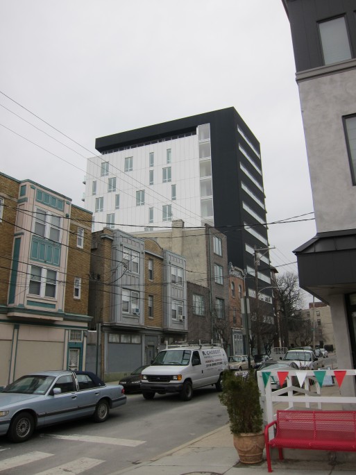
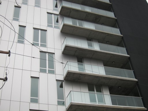
But the 10-story, 40-unit building, designed by Winka Dubbeldam of New York-based Archi-Tectonics, is visually striking, with crisp detailing.
But this is an architect’s building in more ways than one: the best part of the design is to be seen around back.
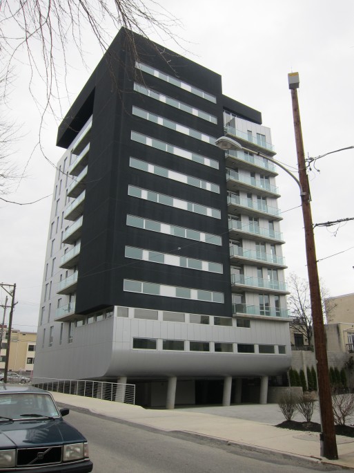
Straight from the comic-book pages of the Archigram Walking City, the columns of the open parking garage look as though the building not only has rooftop views of the Delaware River, but can right well walk itself over for a float. Wicked cool.
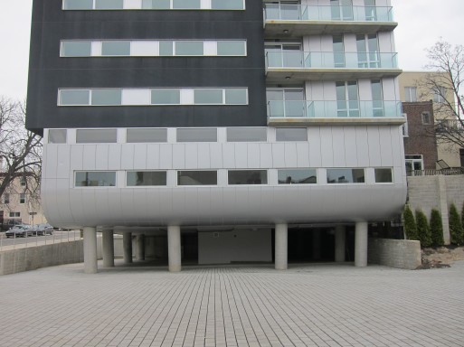
schmod
It would have been difficult for the architects to have ignored the surrounding architecture and urban context any further than they did here.
It’s a stunning building that has absolutely no place or sense of context in its neighborhood. Modern buildings *can* fit into old neighborhoods, provided the extra effort is taken.
I’d also be rather concerned about how well they’ll be able to keep it clean, which seems to be a pitfall of modernist buildings everywhere. I’m also starting to notice a lot of modern European design motifs creeping across the Atlantic — this building certainly wouldn’t be out of place in the EU (not necessarily a bad thing!)
Thayer-D
Wicked ugly. Your right, it is an architects building, not a pedestrians!
Grenier
Schmod and Thayer sum it up nicely, so to an extent am just piling on here. It would be terrific if modernist buildings could at least tame their egos enough to respect the scale of the surrounding buildings. Can someone find a modernist building that evokes an emotional response, and not just an intellectual one? Does the world really need more cold flat surfaces?
Elza Hisel-McCoy
I agree that the style and massing may not be the most context-sensitive, but urbanist street-level perspective it is doing the right things. The front building facade maintains the street wall established by the existing buildings and there appears to be opportunity for ground-floor retail at the front entrance. As a pedestrian, I think the building provides both activating opportunities (the building and retail entrances) and visual interest.
Context, though, is a funny thing, changing over time. In 50 years, this building may be quite contextual, perhaps setting the context. Should 3-story rowhouses forever determine context for this neighborhood? Cities don’t work that way: the old is torn down to make way for the new. This is an ancient phenomenon.
But however cool (or not), these buildings do not provoke in me the emotional response that some of the Richardsonian Romanesque rowhouses do. Those are beautiful buildings. But they also seem to me the sum of the time that produced them, a time which is no more. To have an RR building done today would seem somewhat false and second-hand and would probably not provoke the same emotional response.
Thayer-D
Again with the same the false dichotomy ideological modernists use to promote buildings that many people find offensive. It’s either a modernist building, or a “false and second-hand” building. That’s the same argument architectural schools mislead students into with out any acknowledgment that the modernist style(s) are as historical as any other. I believe modernism as commonly understood was a product of early 1900’s Europe. It’s not about what style is employed, it’s about how succesful a building is.
As for a pedestrian experience, I’m not sure how a handicap ramp strewn across the front is particularly inviting, or for that matter a sunken carport off the side street. Look at the neighboring buildings and how they relate to the street, direct and open access.
And another funny thing about how cities work. Of course they are ever changing (at least one hopes), but the modernist creed of tabula rasa I think was the salient point of the contextual criticism. Up until the modernist era, which you clearly still inhabit, new buildings generally made an effort to blend into their surroundings, if there was something generally acknowledged as worthwhile. Take Richardson, since you seem somewhat familiar with his work, when he designed Sever Hall in the context of Harvard’s original Georgian campus, he held back on the overtly Romanesque qualities of his style in deferment of the neighboring buildings. It’s clearly his building, but unlike the adolescent preening of most modernist buildings, it dosen’t strive to overwhelm the neighbors. Modernist buildings can be contextual, but this one ain’t.
Elza Hisel-McCoy
The important distinction to make here is between urbanism and architecture. I am a pre-modernism urbanist who tends to favor more “contemporary” (loaded term, I know) architecture.
This building, in contrast to the “tabula rasa” of a building like the Legg Mason building in Baltimore and I.M. Pei’s residential towers near the DC waterfront, defines and engages the street. Could it do better? Probably. Would building out to the corner be better? Perhaps. But this is an urban building.
Architecturally, I agree this is not a contextual building. I think that as long as the urbanism is doing more or less the right thing, the architectural test is whether the design is true to itself on its own term and I am more tolerant of potential aestheti-schism (yes, I just made that up.) Thus a new building using a more traditional design precedent (e.g., the Easter Seals center on Spring Street here in Silver Spring) is a reasonable and inoffensive proposition, as opposed to a fake historicist building (see the Takoma Park Town Hall) that engenders vitriolic detachment.
The dichotomy which an earlier commenter suggested and one I find to be true and interesting is that “Modern” or “Contemporary” architecture generally appeal more to the intellect than more romantic styles. Classical civic buildings for the most part are also appealing to our intellect more than our emotions. Some pacific northwest architects (e.g., Miller Hull and James Cutler), and their Scandinavian antecedents, strive to combine a warmth of materials with a minimalist approach to design to evoke a warmer response.
Thayer-D
It’s laudable that you should acknowledge modernism’s reliance on the intellect.
Why then do you make such a point that a neo-richardsonian building would “probably not provoke the same emotional response” from you as I assume a neo-modernist building? At least this explains why most people prefer traditional styles, because 99% of building users respond emotionally to buildings, a fact lost on many architects. This kind of logic is also evident in conflating the word “modern” or “contemporary” with modernism, again, a style almost a hundred years old. It’s modern if it’s “of or pertaining to present and recent time”. Pardon my English.
I also commend you for comming clean with your preference of modernist styles. I wouldn’t rank them as my favorite, but certainly no more or less deserving of being employed by contemporary architects. The only objection I have is to the intolerance you exhibit when referencing certain styles as “fake historicist building(s)”, when they are simply not your cup of tea. If you justify an emotional response with fake intellectualism, you will be called out.
Imagine if we approached other art forms similarly, we would go around decrying contemporary rock n’ roll and jazz as fake, simply for being of another time. That’s silly. We should be embracing diversity in all it’s forms, not creating fake borders with intellectually dishonest arguments. I’ll repeat, it’s not about what style is employed, it’s about how succesful a building is.
Jad
“Crisp detailing” is just right. The randomness of the windows feels a bit studied, though. And not addressing the cross street at all? Just poor manners.
Elza Hisel-McCoy
TD: Being new to the blog-o-sphere, before responding to your last comment I researched blogging etiquette. I did so because I find the tone of your comments somewhat abrasive, and some of the argumentative leaps and pointed statements you make to be unfair restatements of points I am trying to make in an honest fashion.
My research advised fairness and politeness, but above all to respond, because this is after all hopefully not a monologue (on your side or mine). So I attempted to craft a response that did not create a bickerfest, but rather highlighted more substantive issues in a respectful manner (purged of snark!) and hoped you would respond in kind.
Alienation is for the roadways. I love to discuss these issues, but if I am not overly sensitive a bit more civility (as if we were speaking face to face) would be great. If I have somehow given offense, it was unintentional.
I will keep posting and discussing issues and will take all comers, but we gotta be cool about it.
BTW: Thanks to all who read and comment!
Elza Hisel-McCoy
@ Jad: After symmetry and ribbons, the organizing system for fenestration in more contemporary buildings seems to defy analysis. When I was in school, I remember seeing a project where the location of windows was based on fractals. It may not be actually random but, as you suggest, studied randomness, perhaps aping those buildings (I feel like they may be found on the Indian subcontinent, but don’t hold me to that) that are covered in louvered shutters or screens where the pattern of openings represents the collective fluctuation of the whims of the individual inhabitants.
Thayer-D
Elza,
I’m sorry you feel that way. I thought you calling out people who didn’t agree with your opinion as liking “false” or “fake” architecture a bit offensive. You say you want “civility”, and that you don’t want “snark”, again, pardon me for questioning your sincerity. As for your actual points, if you don’t like to be challenged intellectually, you shouldn’t put ideas out there, especially if you take offense that others might have a different perspective.
I’ve met you and you where civil and friendly. Furthermore, I loved your previous post, and said so unequivically. So please, if you want to “be cool about it”, we are in complete agreement about that.
By the way, manners are manners, internet or not (traditional or not 😉
Thayer-D
@ Jad,
Coldn’t agree more with your observations. It’s quite striking and beautiful as an object, and yet respectfully holds the street wall. I think the randomness of the windows is a bit fashionista, but it looks better from the street corner view than the down the street view. Can’t have too many, but played off right, they can make for some striking urban momments in the fabric, that like good music, can awaken the soul.
Elza Hisel-McCoy
@Thayer-D(M?): Final word on my end I promise. I never intended to call out people who didn’t agree with my opinion as liking “false” or “fake” architecture. If that is the way it sounded, I sincerely apologize. I meant only to suggest that, whether the architectural style is more traditional or more contemporary, there has to be a certain truth-to-self quality, which can be difficult to achieve. I think that the new Takoma Park town hall does not succeed in being a traditional building, while the new apartment building at Fenton and Bonifant does not succeed in being a “contemporary” building. I am guessing we are in agreement in principle, if perhaps not on the choice of example.
I love discussing ideas and being challenged intellectually. I think we got off the track a little bit and will be more careful in my word choice and elucidation of my arguments. Peace out.