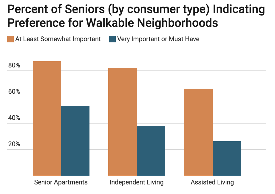
Skip to content

walkable

May 31 12

Walkable Communities vs a Walk-in Closet

by claudia kousoulas

Suburbs have always been an indicator of economic status. If you lived in them, you were wealthy enough to take on a mortgage, maintain a house and yard, and eventually own and maintain one or even two cars.

At some point, that shifted. Living in the city and maintaining a middle class lifestyle took an upper class income. Limited attractive neighborhoods and buildings cost a premium. And if local schools and services were not up to par you needed to pay tuition and fees.

Now, according to Christopher Leinberger and Mariela Alfonzo in the New York Times, a larger number of city neighborhoods are outstripping the suburbs in desirability and thus in per square foot value. Their recent report finds that walkable places have “become more gentrified over the past decade,” with wealthier and more educated residents. And from a list of the walkable communities examined, you won’t be surprised by that finding–Bethesda, Penn Quarter, Logan Circle, Chevy Chase Lake.

But what are the quantifaible elements of a walkable community? He and his co-author found that “the absence of a clear classification of the mix of residential, office, and retail elements that comprise walkable urban places…has been one of the most significant barriers to addressing their demand.” But demand is there–he found that in Atlanta only 35 percent of people who wanted to live in a walkable community actually did.

The characteristics the authors used to define a walkable place are somewhat Lynchian (with my comments in parens):

  • aesthetics (some subjective judgement of decoration, but also views and outdoor dining)
  • connectivity (in the sense of barriers)
  • density
  • form (does the place feel like a place)
  • pedestrian amenities (both practical and decorative)
  • personal safety (judged by indicators like graffiti and litter)
  • physical activity
  • proximity of uses (mixed uses)
  • public spaces and parks (a la Holly White–movable chairs, touchable water)
  • traffic measures (not car throughput, but slowing measures–signals and calming)

(The not easily quanitifiable measure I use for a walkable place is the ice cream cone factor. Can I get a cone, and then have a nice and interesting walk while I eat it, and will there be a place to toss my napkin when I’m done. Extra points if I can ride my bike there and burn off some of those calories ! I wouldn’t last a day at Brookings.)

Once you can describe these places, their economic impact can be measured, and Leinberger finds that impact to be considerable. Even controlling for household incomes, walkable places show a higher economic performance, with premiums in office and residential rents as well as in retail sales and housing values.

From the report: “Federal, state, and local policy makers should conduct a systematic review of existing public policies that are biased against walkable development, and adopt new measures aimed at facilitating (or at least removing roadblocks to) this type of development.”

As a suburb within walking, biking, and transit distance of downtown, and one that has its own urban centers, Montgomery is advantagously postioned to add value by creating car alternatives to getting downtown (I’m looking at you bikeshare) and by building up its own urban areas.

The White Flint Plan, the BRT study, the zoning rewrite, even the Parks Department’s community garden program are all moves that will redfine how and were we live by adding more choices. With plenty of suburban single-family communities and the preservation of the Agricultural Reserve, Montgomery will become a layered place, one with options and interest that all add value.

where's my ice cream cone?!


May 31 11

Dangerous by Design

by claudia kousoulas

No, not the bad boys your mother warned you about, but the streets you may (try to) walk along everyday.

Transportation for America’s latest report has plenty of media-catching data:

  • between 2000 and 2009 more than 47,700 pedestrians were killed in the United States, the equivalent of a jumbo jet crash every month
  • in that same time period, a pedestrian was struck by a car or truck every 7 minutes
  • while motorist deaths have dropped 27 percent in the past decade, pedestrian fatalities have fallen at only half that rate, by just over 14 percent.

But you won’t be surprised to hear that a scant fraction of federal transportation funding distributed to states for local projects is dedicated to pedestrian safety. An attitude shift needs to drive a funding shift. “Taxpayer money…should be used to build streets, roads, and highways that are safe for all users.”

Part of that attitude shift could be encouraged by viewing the transportation bill as a health bill–it affects our air quality and our ability to safely get exercise by walking more and driving less.

Of course, the most fun part of these kind of reports is seeing where we stand compared to other metro areas. The most dangerous–Orlando-Kissimmee, Florida–with a pedestrian danger index of 255.4. The D.C. metro area rated a 54.6 danger index. Not bad, but not as good as the safest metro area, Boston, with a pedestrian danger index of 21.6.

If you’re curious about just how walkable your neighborhood is, try this site.

Mar 15 10

Strange Maps

by claudia kousoulas

Here’s some inside baseball for you—planners love maps. Mention letraset and T-squares to older planners and they’ll start squirting tears for the good old days and bemoaning the cold computer line.

Maps, no matter how they’re made, have tremendous expressive potential and we planners argue long and hard about their content and style. Everyone has a different idea about land use colors, boundary lines, and north arrows.

Here’s someone else who cares about maps and I think two of them are of particular interest to planning in Montgomery County.

Entry 441 is a map of San Francisco’s privately-owned public open spaces (POPOS). Montgomery County has its share of these and master plans recommend more. Will these public amenities, negotiated in exchange for additional revenue-generating density, melt into private property as they have in San Francisco? By the way, this is a beautiful map—crisp, focused on its primary information, easy to print, and easy to read.

And look at entry 439, two postcard maps of Australia laid over different regions of the world, most notably the U.S. and Europe. Australia is big, and no matter what they say, size matters.

Here’s what you get when you overlay a Sam Eig Highway interchange on Bethesda’s Woodmont Triangle.

How we spend our time and land is up to us, and next time someone tells you a place is walkable because it has brick sidewalks and street trees, ask them about scale.

Switch to our mobile site